ウェブサイトで動きのある表現をしようとすると、ひと昔前ならFlash、そしてJavascriptなどが必須だったが、今やCSSでも色々な表現が可能となった。
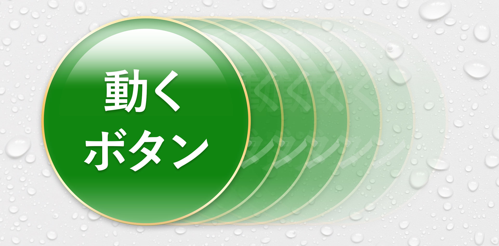
そこで今回は、ボタンにアクションをつけてみた。
見た人にインパクトを与える「動き」を実践してみよう。
実際に使ってみる
アニメーションにはCSS TransitionとCSS Animationの2つのプロパティがある。
CSS Transitionは変化や移り変わりという意味で、変化するまでの時間を設定するプロパティ。
単純な動きのアニメーションにむいている。
一方のCSS Animationは、キーフレームアニメーションを適用できるプロパティで、細かい動きのアニメーションが実装できる。
早速、具体例でその働きを確認してみよう。
後者のCSS Animationを採用していて、
シンプル横ゆれ

【HTML】
<img src="btn.png" class="btn01" />
【CSS】
.btn01 {
  animation-name: shake01;
  animation-duration:1.8s;
  animation-timing-function: ease-in-out;
  animation-iteration-count: infinite;
 }
@keyframes shake01{
from{
transform: none;
}
10% {transform: translate3d(-2%, 0, 0);
}
25% {transform: translate3d(2%, 0, 0);
}
40% {transform: translate3d(-2%, 0, 0);
}
55% {transform: translate3d(2%, 0, 0);
}
70% {transform: translate3d(0, 0, 0);
}
99% {transform: translate3d(0, 0, 0);
}
to { transform: none;
}
}
中身を見てみよう。
CSS Animationは、キーフレームアニメーションを@keyframesで定義する必要があるので、まずはanimation-nameを定義。
animation-durationは、1回のアニメーション周期が完了するまでの所要時間を設定。
animation-timing-functionは、周期の中でどのように進行するかを設定するするプロパティで、ease-in-outは、ゆっくり変化し、速度を上げ、また速度を落とすという動きになる。
animation-iteration-countは、再生される回数を指定し、infiniteは無制限に繰り返す値。
また、@keyframes内のtranslate3dは、要素をX方向とY方向とZ方向の距離で3D移動を指定し、記述としては、translate3d(X方向の距離, Y方向の距離, Z方向の距離)となる。
ズームイン・アウト
【HTML】
<img src="btn.png" class="btn02" />
【CSS】
.btn02{
animation: bounce01 1.5s infinite ease-in-out;
}
@keyframes bounce01 {
0%, 100% { transform: scale(1.0) }
50% { transform: scale(0.9) }
}
先ほどの横揺れと基本的には同じで、animation-name、duratio、timing-function、iteration-countをまとめた記述にすると上記のような記述になる。
@keyframes内のtransform: scaleは、大きさを指定していて、100%と90%の大きさでズームイン、ズームアウトを繰り返している。
着地してみた
続いて大きな動きにしてみました。
基本的には前述と同じで、応用編のようなものかな。
【HTML】
<img src="btn.png" class="btn03" />
【CSS】
.btn03 {
  animation: poyon 2.5s infinite linear;
}
@keyframes poyon {
  0%   { transform: scale(0.8, 1.4) translate(0%, -100%); }
  10%  { transform: scale(0.8, 1.4) translate(0%, -15%); }
  20%  { transform: scale(1.4, 0.6) translate(0%, 30%); }
  30%  { transform: scale(0.9, 1.1) translate(0%, -10%); }
  40%  { transform: scale(0.95, 1.2) translate(0%, -30%); }
  50%  { transform: scale(0.95, 1.2) translate(0%, -10%); }
  60%  { transform: scale(1.1, 0.9) translate(0%, 5%); }
  70%  { transform: scale(1.0, 1.0) translate(0%, 0%); }
  100% { transform: scale(1.0, 1.0) translate(0%, 0%); }
}
まとめ
CSSだけでもこんな感じで動きが出せる。
今回はボタンに動きをつけたが、transformは他のプロパティと組み合わせるともっと多くのことができる。
今度は文字などに動きをつけるCSSもご紹介したい。